Stop Press! Woodland creatures produce their own newspapers!
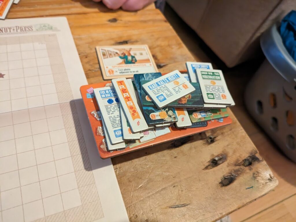
In Fit To Print you’ll be frantically choosing which articles, photographs, and adverts you want to publish in adorably-named papers such as The Chestnut Press or The Evening Hoot. This manifests as players grabbing facedown tiles from the middle of the table, taking them back to their equally adorable 3D desks, before flipping them to see whether the tile is an advert, photo, or article, and deciding whether they want to keep it. Those that don’t make the cut get returned to the pile faceup, ready for a rival to claim and print them.
Read all about it!
There are two main phases in the game – the Reporting phase and the Layout phase. The Reporting phase is the one I described above which is just a grab against the clock. If it sounds like Galaxy Trucker to you, then yeah, that’s a fair comparison. The big difference, however, is what happens when the time runs out. Just for reference, there’s no timer included. Just use a phone, clock, stopwatch – whatever. The time limits in the rulebook dictate the difficulty level.
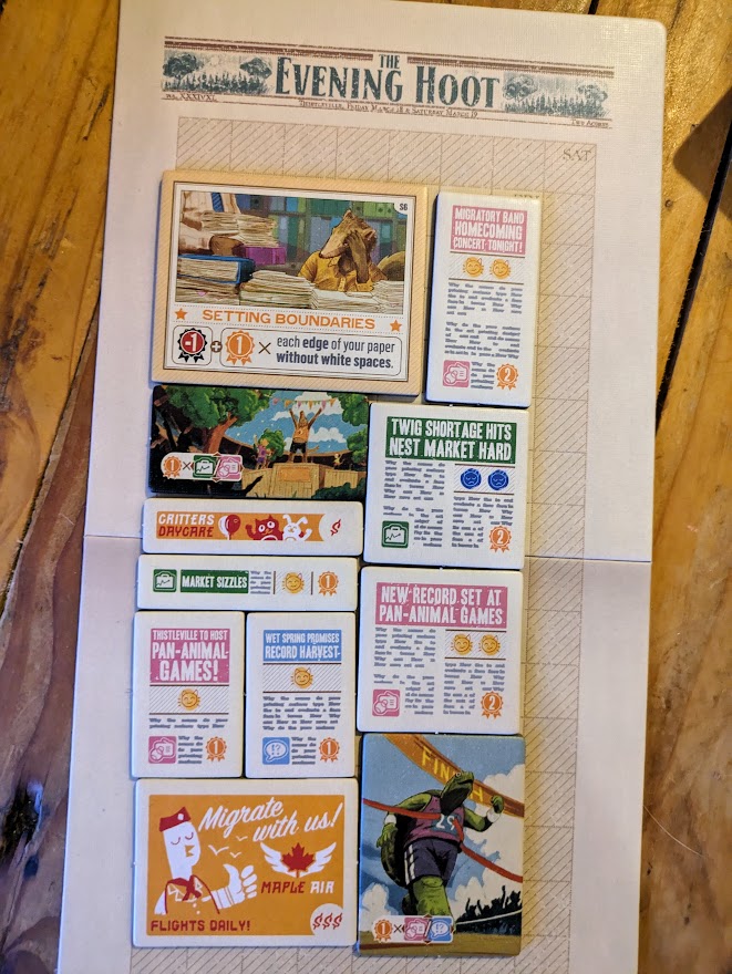
Once the time runs out, you move into the Layout phase, and that’s where the comparison to Galaxy Trucker stops. In that game, you make the best spaceship out of the parts you’ve got. In Fit To Print you’ve each got a board that represents the front page of your woodland broadsheet, and just like in real life, you don’t want to leave blank space on the page. So the idea is to make sure that you pick up enough tiles to cover the page, but at the same time you don’t want to pick up more tiles than you can fit, as you’ll get penalised for taking tiles you don’t place.

On top of that, there are rules for placing tiles. You knew there’d be more rules, didn’t you? Adverts can’t be placed adjacent to adverts, photos next to photos, or articles of the same colour next to one another. Just arranging your tiles to follow those rules is quite a challenge, but wait, there’s more! Photos have scoring conditions based on what’s placed next to them. Articles have either happy faces or sad faces on them, denoting good and bad news respectively. If the level of good and bad news isn’t perfectly balanced, you get penalised again.
On top of that, as if we needed more to think about, are the centerpiece tiles that can score you more points based on the conditions printed on them. It all results in a two-dimensional tile-placement puzzle which adds layer after layer of other things to think about. You’ll finish your layout and be happy with finally managing to cover the board, then start moving things and looking for ways to increase your score, only to realise that you can’t remember what it looked like. Argh! It’s simultaneously hilarious and infuriating, and it’s nobody’s fault but your own.
The Sunday papers
It’s frustrating when you teach a game to people and then play it on the understanding that it’s “just a learning game“, meaning you basically write that game off. Fit To Print actually has three rounds, so even if you do terribly in one round, there’s more than enough chance to redeem yourself later. I love the way the Friday edition works on a grid of 7×14 squares, Saturday on a slightly bigger 8×16 grid, with Sunday expanding once again and going to 9×18. It doesn’t sound like it’s getting much bigger, and on the boards, it doesn’t even look like it’s getting much bigger, but that’s just an illusion. The three issues use 98, 128, and 162 squares to fill respectively.
Why the basic maths lesson? Or should I say ‘math’ lesson for my readers on the other side of the Atlantic? I bring it up because it becomes really tricky to figure out how many tiles you have compared to how many you need. It’s not like you can even just spread the tiles out to get a rough idea. Designer, Peter McPherson (you might remember that name from Tiny Towns and Wormholes, both of which I reviewed here and here respectively) saw that coming and added a rule which says every tile you take has to be piled up on your little 3D desk. Trying to estimate how much of your board a couple of stacks of tiles will cover is a game in itself.

If you’re still sitting there on your throne of nerddom, thinking this all sounds a bit easy, I’ve still got a couple more surprises in store for you. You could add in the character cards which give each player a unique power, and there’s another option to add Breaking News cards which throw random events into each day which introduce different restrictions and bonuses.
As you can probably tell at this point in the review, this isn’t just an entry-level tile placement game. I can say from experience despite having a ton of variety in the way you play, and despite the various rules and constraints you’re working around, it’s still a very family-friendly game. I speak from experience. I played it with my wife and son and immediately after playing, they asked to play again. Take it from me when I say that that’s high praise indeed. We didn’t even bother using the relaxed, family-friendly rules in the rulebook.
Final thoughts
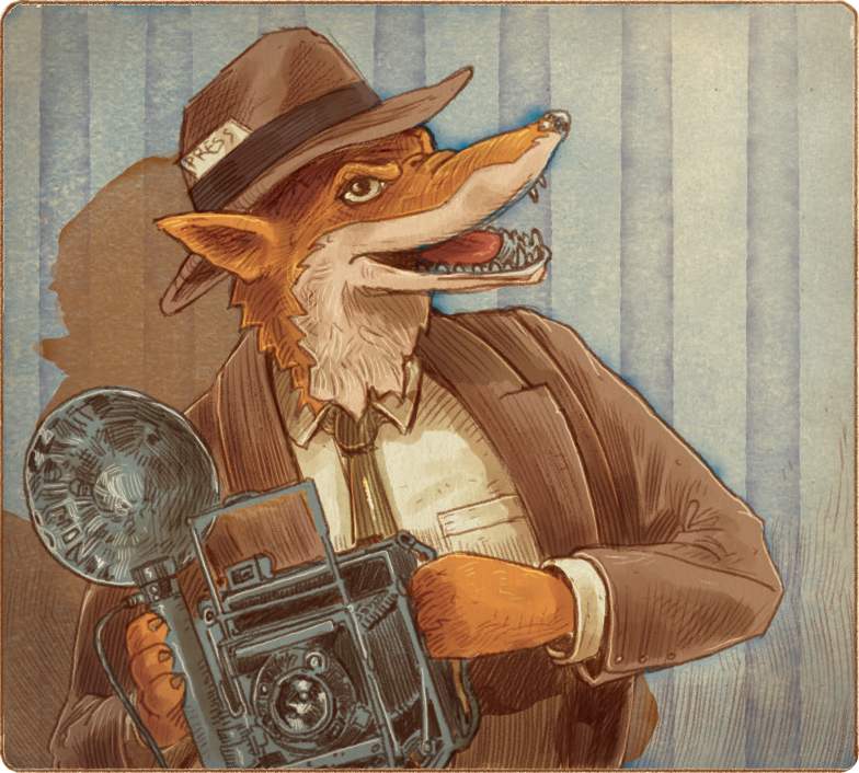
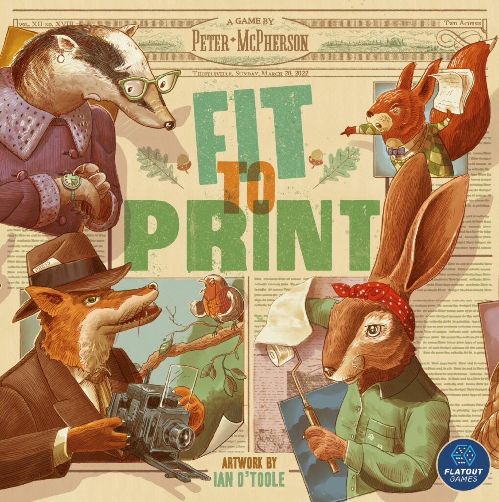
My eyes lit up when I saw that Ian O’Toole was responsible for the art in the game. It’s fair to say that I’m a bit of a fanboy, but I also know that games with his touch on them tend to have great graphic design too, and Fit To Print is no exception. Being able to tell what a tile has on it at a glance is extremely important in a real-time game like this, and he nails it.

All this talk of real-time and the frenetic energy the game delivers might turn you off. You might have a disability which affects your fine motor skills, or vision problems which make it hard for you to tell at a glance which kind of tile is which. Maybe you just can’t stand real-time games because you don’t enjoy them. Almost all of my plays have been played using the real-time rules, but it’s important to note that there’s a turn-based variant included in the rulebook which alters the gameplay and makes it much more strategic.
The cherries on top of the Fit To Print cake are the solo mode, puzzle mode, and challenges. The solo mode works a lot like the multiplayer game, which makes it a great way to practice, and I really like the inclusion of the puzzles. Each puzzle has a strict setup of tiles available, with the knowledge that you can’t use them all. If you like to take your time to puzzle your way to the best score, you’ll love it.
Fit To Print blends puzzles and fast-paced gameplay into a tile-laying game that looks beautiful. It’s twee, it’s fast, it’ll hurt your brain, and you’ll have a lot of fun with it.
Review copy kindly provided by Alderac Entertainment Group. Thoughts and opinions are my own.
Enjoying this article? Consider supporting me.

Fit To Print (2023)
Design: Peter McPherson
Publisher: Flatout Games
Art: Ian O’Toole
Players: 1-6
Playing time: 30 mins
Adam is a board game critic with over 15 years of experience in the hobby. A semi-regular contributor to Tabletop Gaming Magazine and other publications, he specialises in heavyweight Euro games, indie card games and transparency in board game media.


